.svg)
.jpg)
Designing a leading app experience - App UX & Motion
Empowering Westfield shoppers with the Westfield Plus app.
Simon from Scentre Group reached out to us to help people make the most of every visit to Westfield by designing a new app called Westfield Plus. We teamed up with the Centre Alliance (their internal design team) to help scope, design and launch this new experience. The purpose of Westfield Plus is to enhance the physical experience of visiting a Westfield centre by providing utilities such as wayfinding, valet services and parking timer notifications. The goal is for the user not to stay on the app, but to use it to fulfill some purpose then return to enjoying their experience in-centre. We helped out with a whole range of things, from branding and app design to motion design and even a teaser video for the app.
Craft a leading app experience for Westfield shoppers.
Our aim with the Westfield Plus app was to transform the shopping experience at Westfield centres from a store-centric to a human-focused approach, enhancing personal engagement and in-centre enjoyment.


Expanding Westfield’s brand identity.
The branding for Westfield Plus is derived from the core Westfield branding, bringing in the signature logo and “W” device as well as the red colour palette and recurring patterns, such as the angles and tessellating patterns.
Our branding strategy for Westfield Plus began with brand workshops to align the app’s design with Westfield’s core values and focus on enhancing user experience. These sessions ensured the branding resonated with its target audience, emphasising functionality and engagement.
We developed a custom icon and illustration language designed to improve UX by making navigation intuitive and the interface visually engaging, simplifying user interactions and boosting usability.
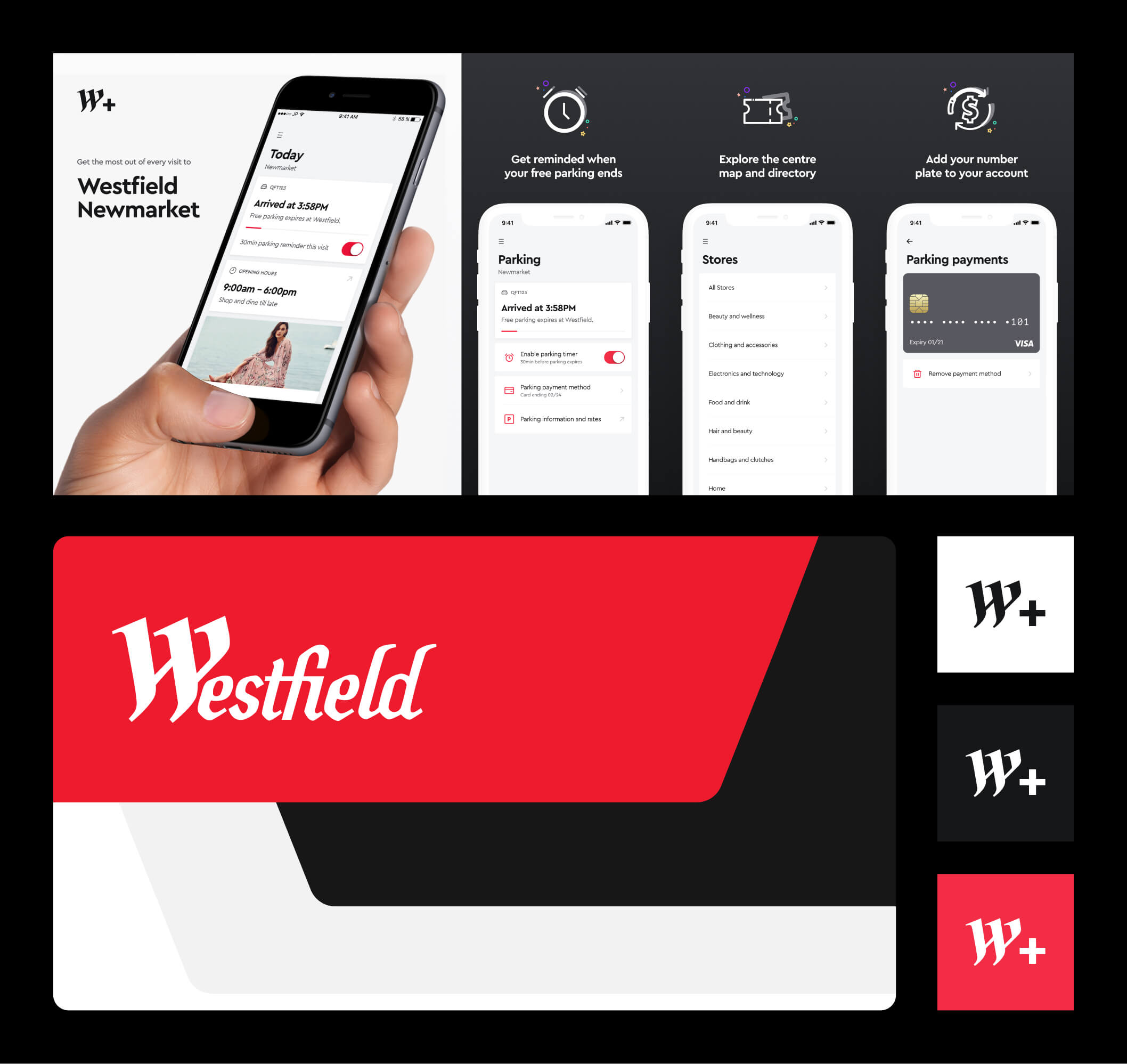
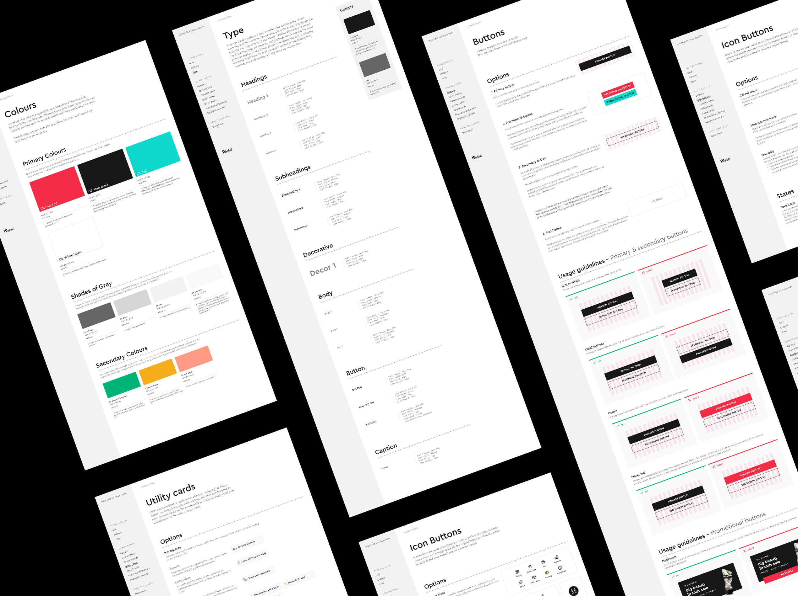
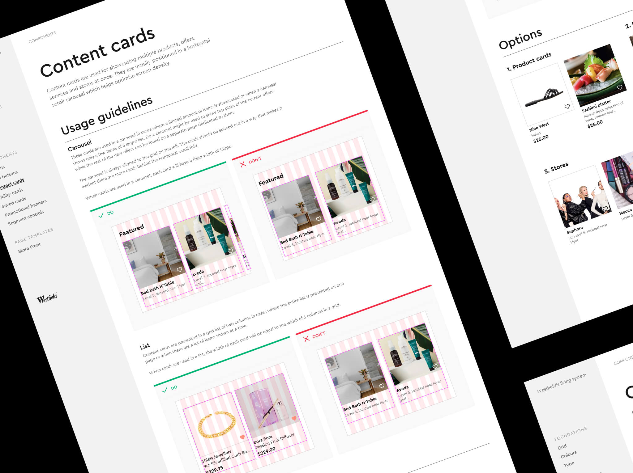
Building Westfield’s mobile first design system.
We crafted a design system for the Westfield Plus app focused on usability, brand consistency, and a mobile-first approach, ensuring seamless operation on mobile devices. The system aligns with Westfield’s brand identity and includes tailored components for iOS and Android, following Apple’s Human Interface Guidelines and Android’s Material Design. This design strategy ensures a consistent and optimised user experience across all platforms.
Designing efficient journeys for shoppers.
The app design for Westfield Plus was massive and meant more than a year of strategy, workshops, roadmap, exploration, discovery, scoping, designing and experimenting.Beyond the core features (Parking, Map, Stores), many of the new ideas stemmed from solving for visitor problems and opportunities when entering a complex, for example:
“I want to recall where I parked my car”: forgetting where you parked is a pretty common thing, perhaps we could bring this into the app with a letter + number selector?
“I want to visit the centre when it’s not packed”: maybe you’re going for lunch and want to avoid queues like a lot of CBD workers do! maybe we can visualise popular visiting times.
“I want to find the toilets easily”: highlighting common communal areas on Today could be helpful.
A frictionless parking experience.
We designed a feature in our app that streamlines the parking experience by allowing users to book, pay and locate their car directly within the app. This integration ensures a frictionless process, enhancing convenience and efficiency for every visit.

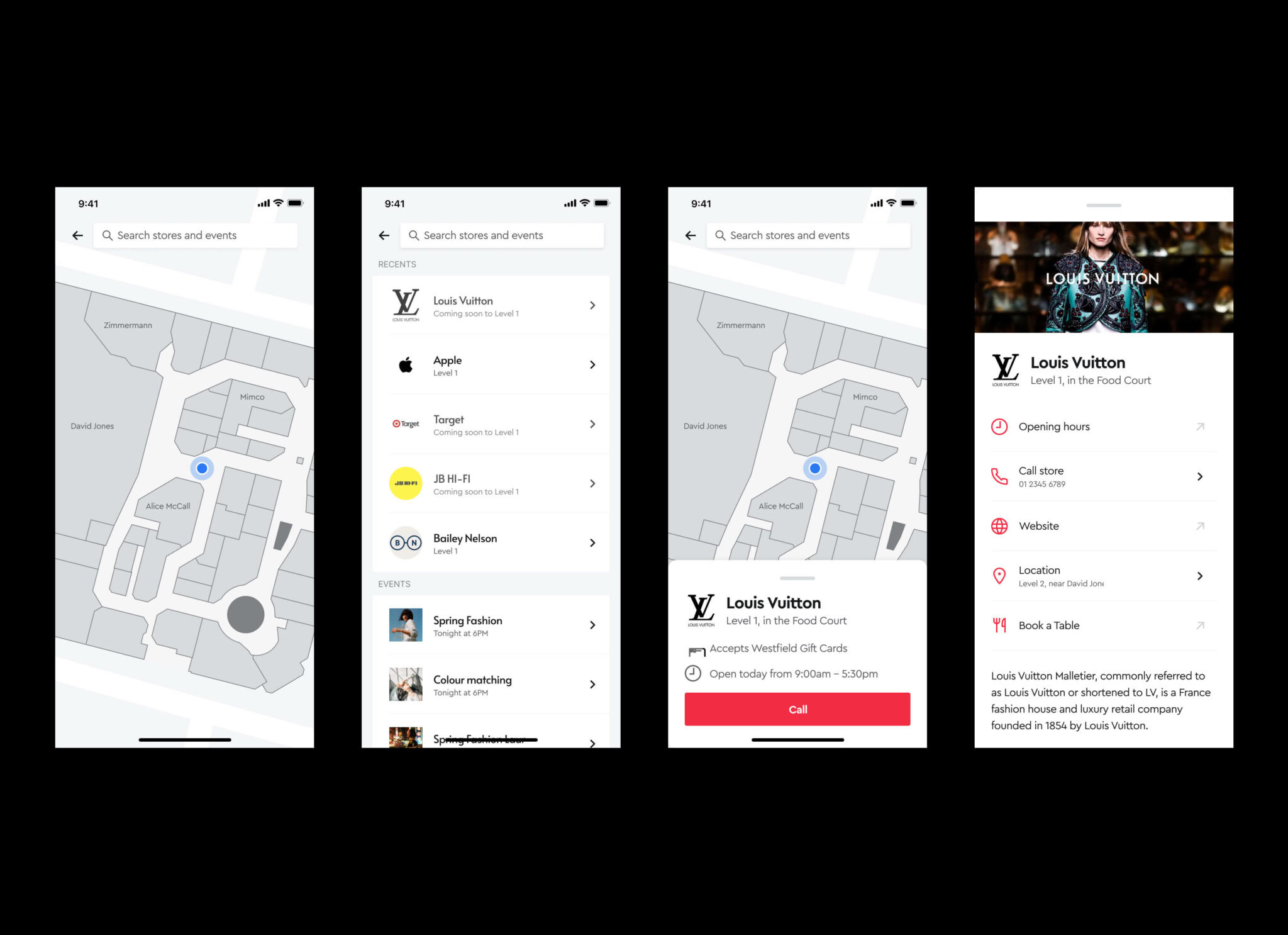
Finding stores made easy.
We optimised our shopping app with a user-friendly map interface, enhancing the UX by simplifying store discovery. This intuitive navigation tool helps customers effortlessly locate their desired stores, improving user engagement and boosting sales potential.
- Increased store awareness
- Increased shopping efficiency
Gift cards, all in one place.
We enhanced the shopping experience by improving the gift card feature in the app, which allows customers to store and manage all their gift cards conveniently. This simplifies transactions, encourages usage, and increases spending by making gift cards easily accessible and manageable.
- Increased purchase potential
- Increased brand engagement


Creating moments of delight with motion.
While we were designing the Westfield Plus app, we took great care exploring animation, illustrations, 3D rendering, sounds and haptics to create a more vibrant and lively feeling. As one front on the mission to push the boundaries of this app’s design, we decided to experiment with motion design for “key moments” in the app, for example:
Finishing onboarding
Adding a plate to your account for the first time
Wrapping up your Hands-Free or Valet experience.
For example, we experimented with the visual concept of “tokens”, which raised many questions: what does a token look like (a coin, a ticket)? How can we bring the core principle of vibrancy to this moment, what does it look like? How can we make the user feel super good about completing this task?
01 Key moment
02 Key moment
Articulating the vision with video.
To create a shared vision of Westfield Plus among the team, we created a sizzle reel using some high-level mockups and footage from here and there. This ended up being one of our favourite parts of the project as it articulated the vision so well.
Finishing onboarding
Adding a plate to your account for the first time
Wrapping up your Hands-Free or Valet experience.
For example, we experimented with the visual concept of “tokens”, which raised many questions: what does a token look like (a coin, a ticket)? How can we bring the core principle of vibrancy to this moment, what does it look like? How can we make the user feel super good about completing this task?

Next Case Studies