.svg)
Changing the way we work and pay
Creating a fun payroll experience.
Traditionally, payroll isn’t a fun or glamorous industry. KeyPay intended to change that.
We aimed to help KeyPay find the right balance between the complexity of the payroll world as well as the fun and ease their customers were seeking. Moreover, we intended to communicate KeyPay’s vision through a new fun and thought-provoking brand experience.
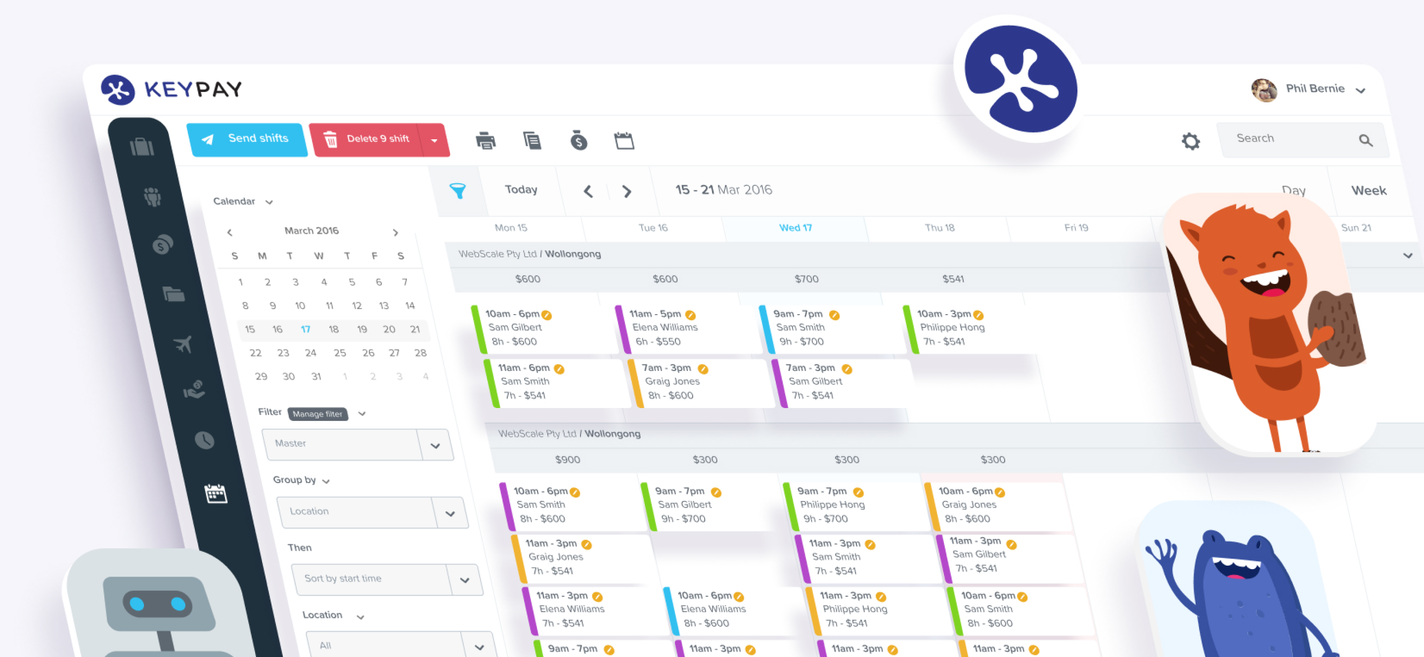
Making payroll a more seamless experience.
Raw.Studio created an experience where all of the processes required for payroll would be combined in one place. This solution would let KeyPay’s customers save hours of work and remove the manual human work.


Brand expansion
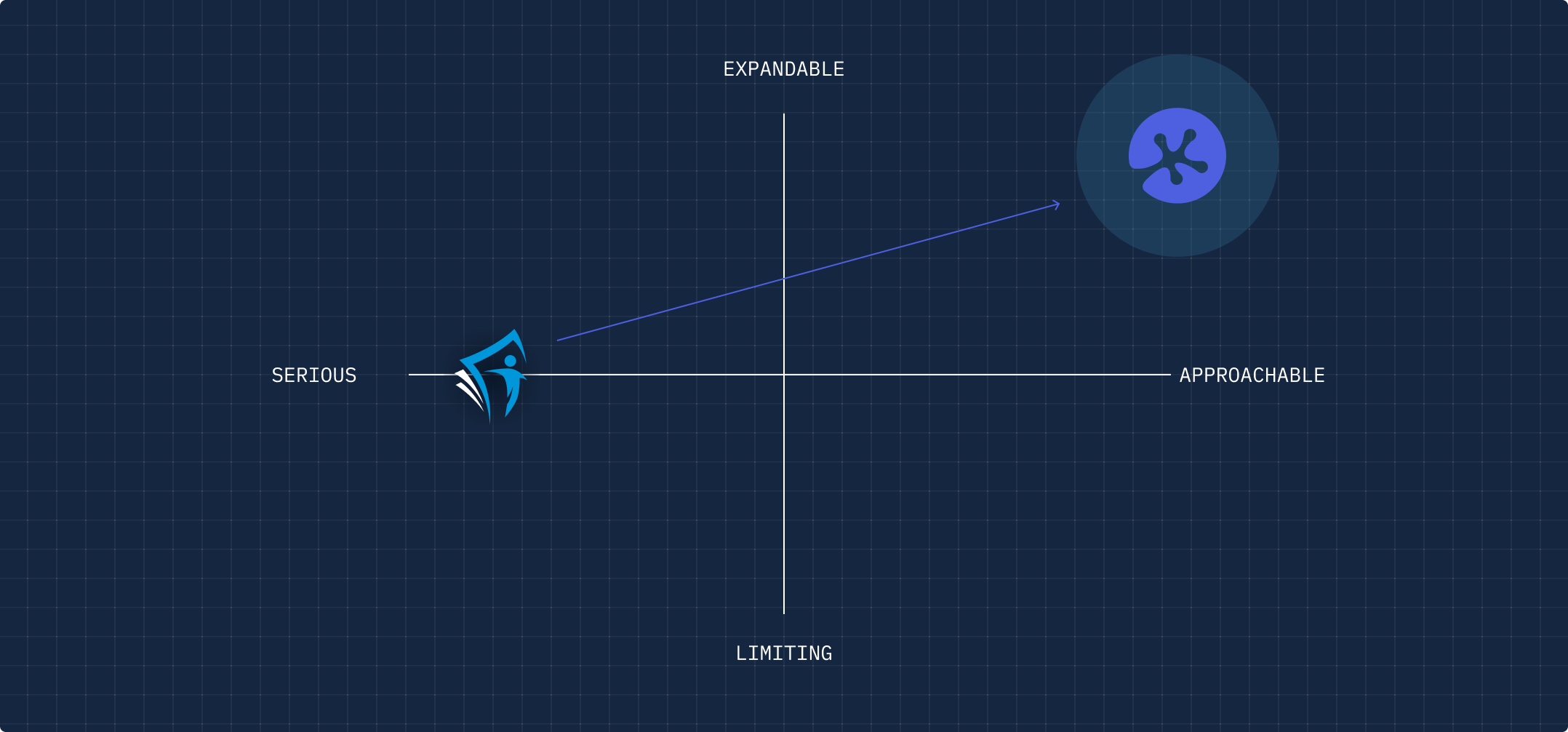
We’ve completed a series of exercises to establish the company’s values and mission. KeyPay wanted to differentiate themselves from their competitors, introducing a new and exciting way to payroll. Identifying the resemblance among KeyPay’s competitors has let us on the path of pushing the brand to new heights.
In order to identify the areas we could improve in the product, we conducted a series of UX practices such as product audit, user journeys, interviews and more. These practices set a clear vision of taking the payroll process to a new, advanced level.
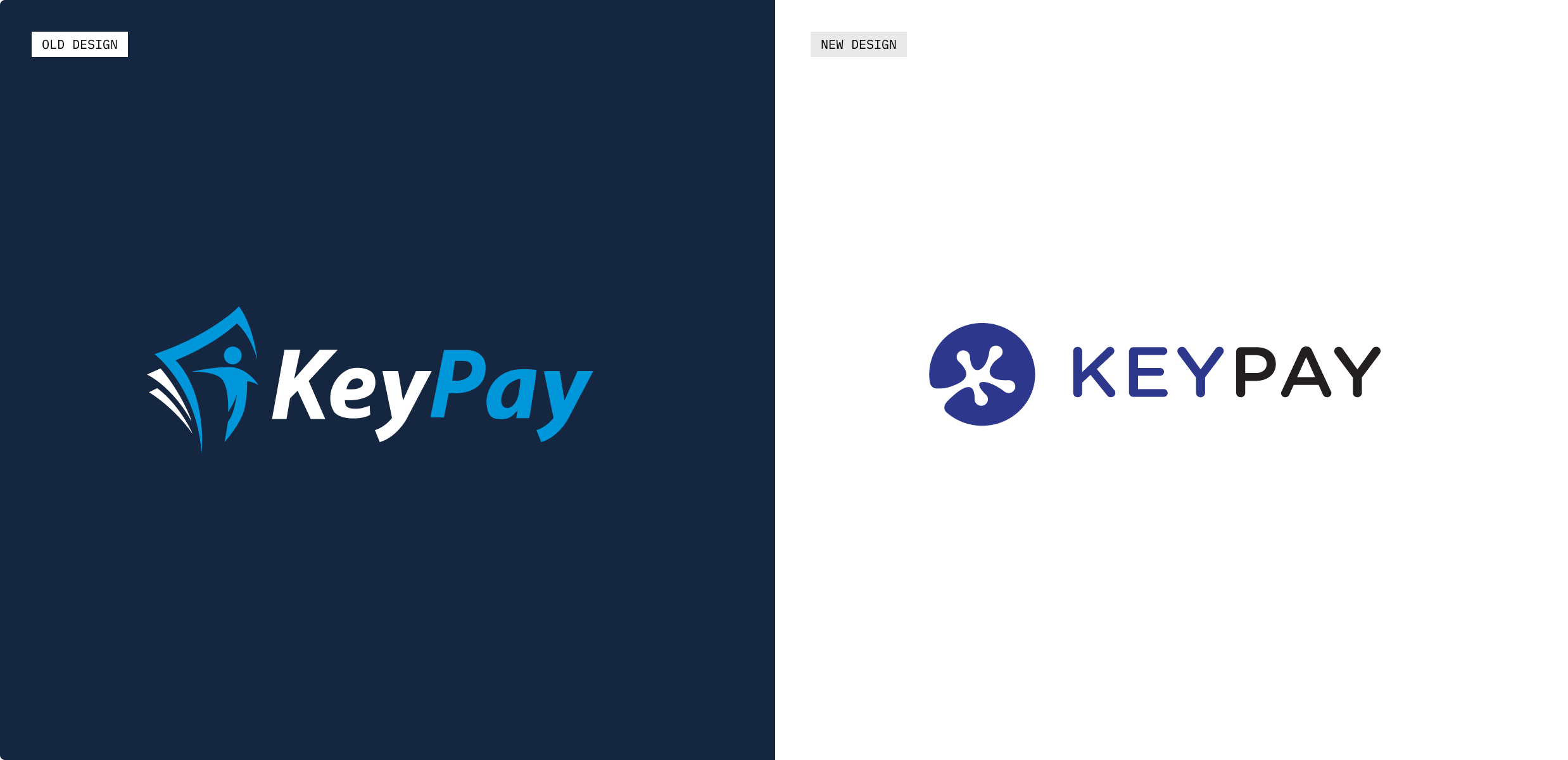
Brand renovation
KeyPay wanted a symbol that visually communicated that they provided a streamlined payroll experience that was fun and easy.In Chinese Feng Shui, the money frog attracts wealth and prosperity. This aligns with KeyPay’s purpose of facilitating money flow and helping people get paid. The frog’s foot in the logo also doubles up as the letter ‘K’, which stands for KeyPay.
Designed for scalability
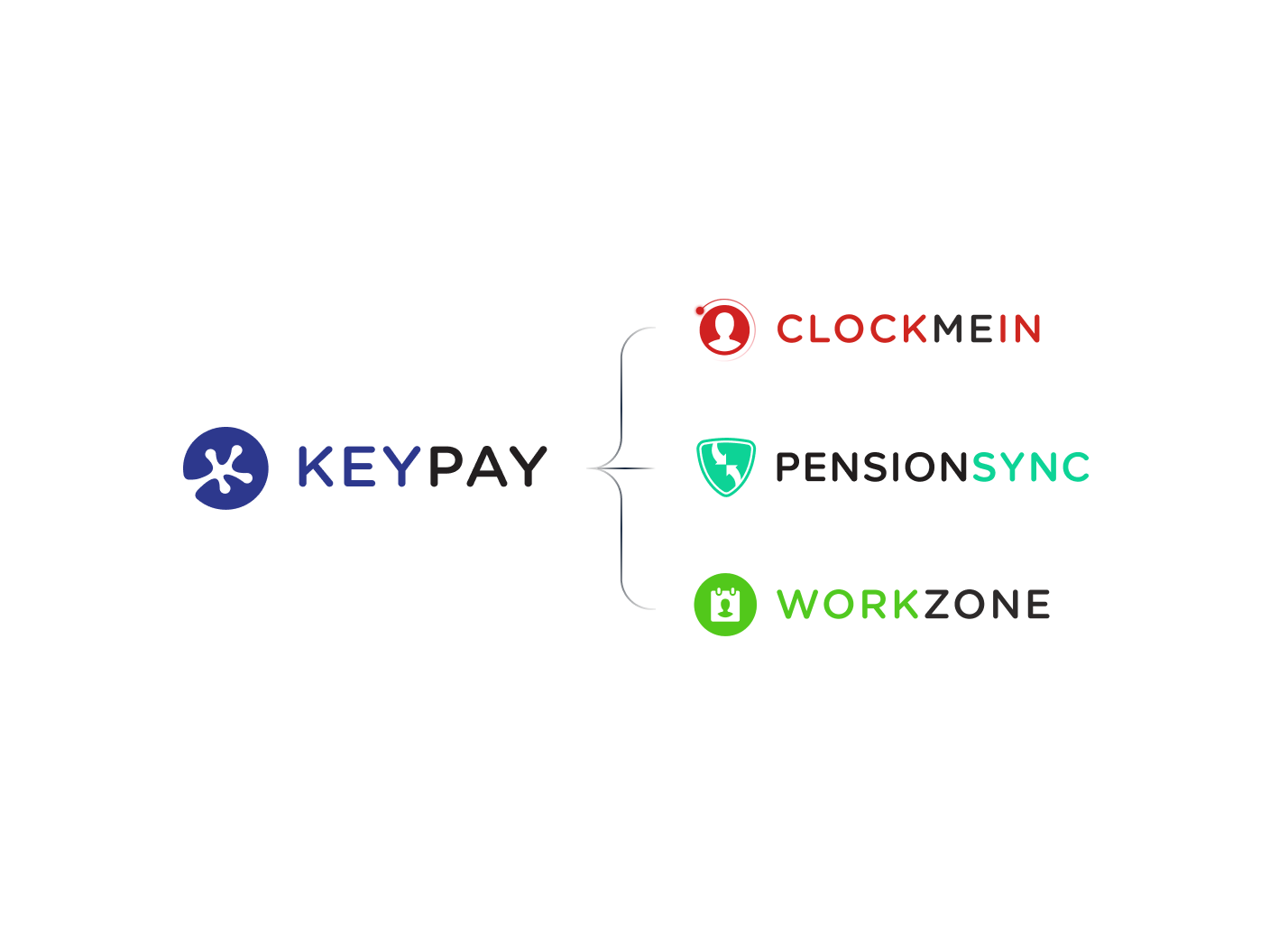
KeyPay’s new identity needed to be scalable with its family of brands. Using the same font allowed us to maintain the fun & approachable look and feel, and applying the same logo composition helped create cohesiveness in the family of brands.
Designed for scalability
KeyPay’s new identity needed to be scalable with its family of brands. Using the same font allowed us to maintain the fun & approachable look and feel, and applying the same logo composition helped create cohesiveness in the family of brands.
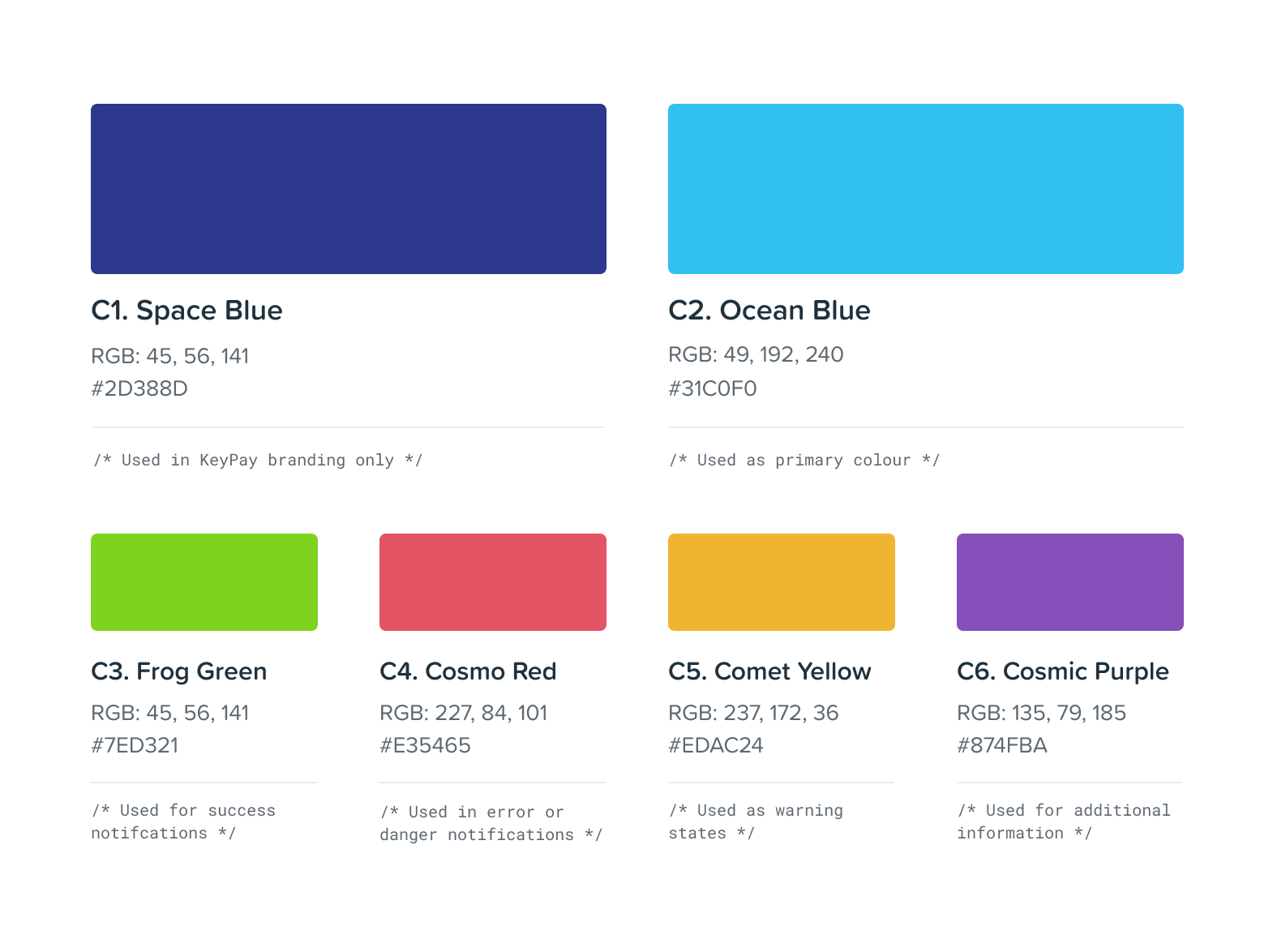
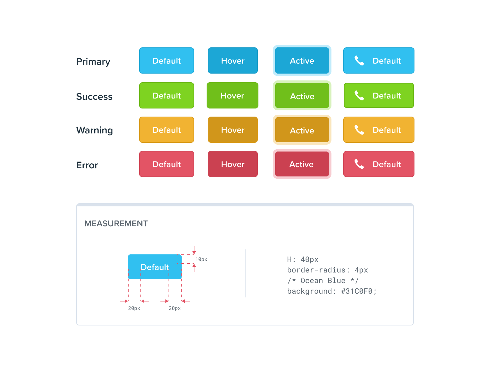
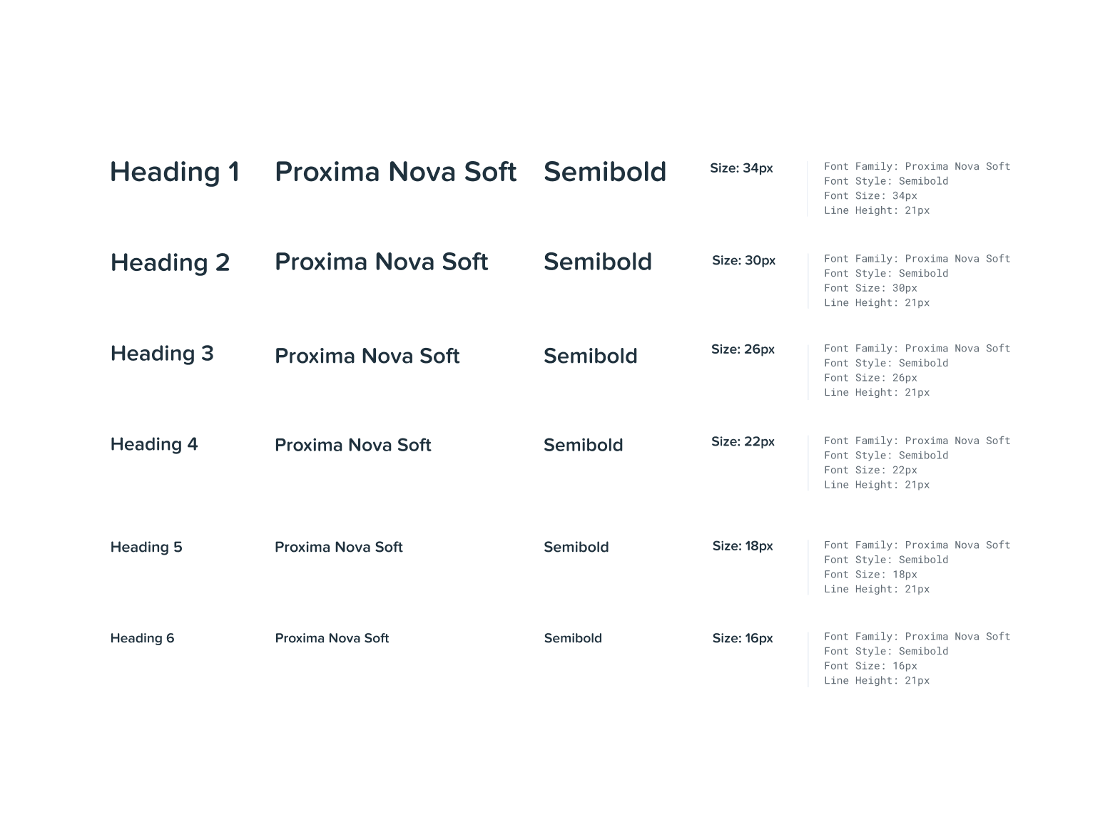
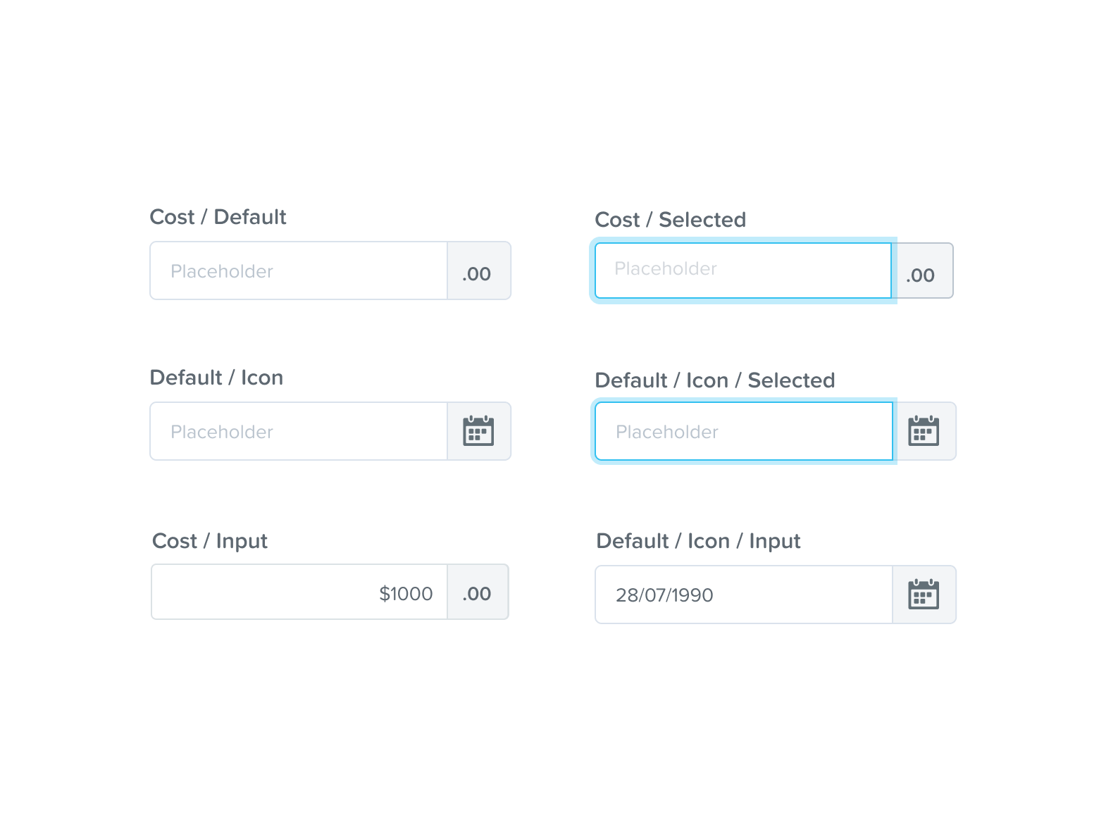
Design System
One of the challenges KeyPay wanted to address was reducing design and tech debts. To ensure that internal dev and design teams are efficient, we needed to re-structure how they approached work. We worked closely with the client’s internal teams to create a well-organised system that can be applied throughout all product areas in a structured way that eliminates errors and improves loading times.


Connecting with KeyPay’s customers
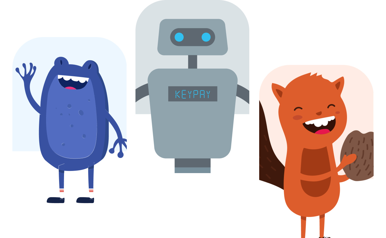
We designed an engaging educational video that breaks down KeyPay’s services, showcases brand values through visual language and illustrates all of our newly designed mascots.
.png)
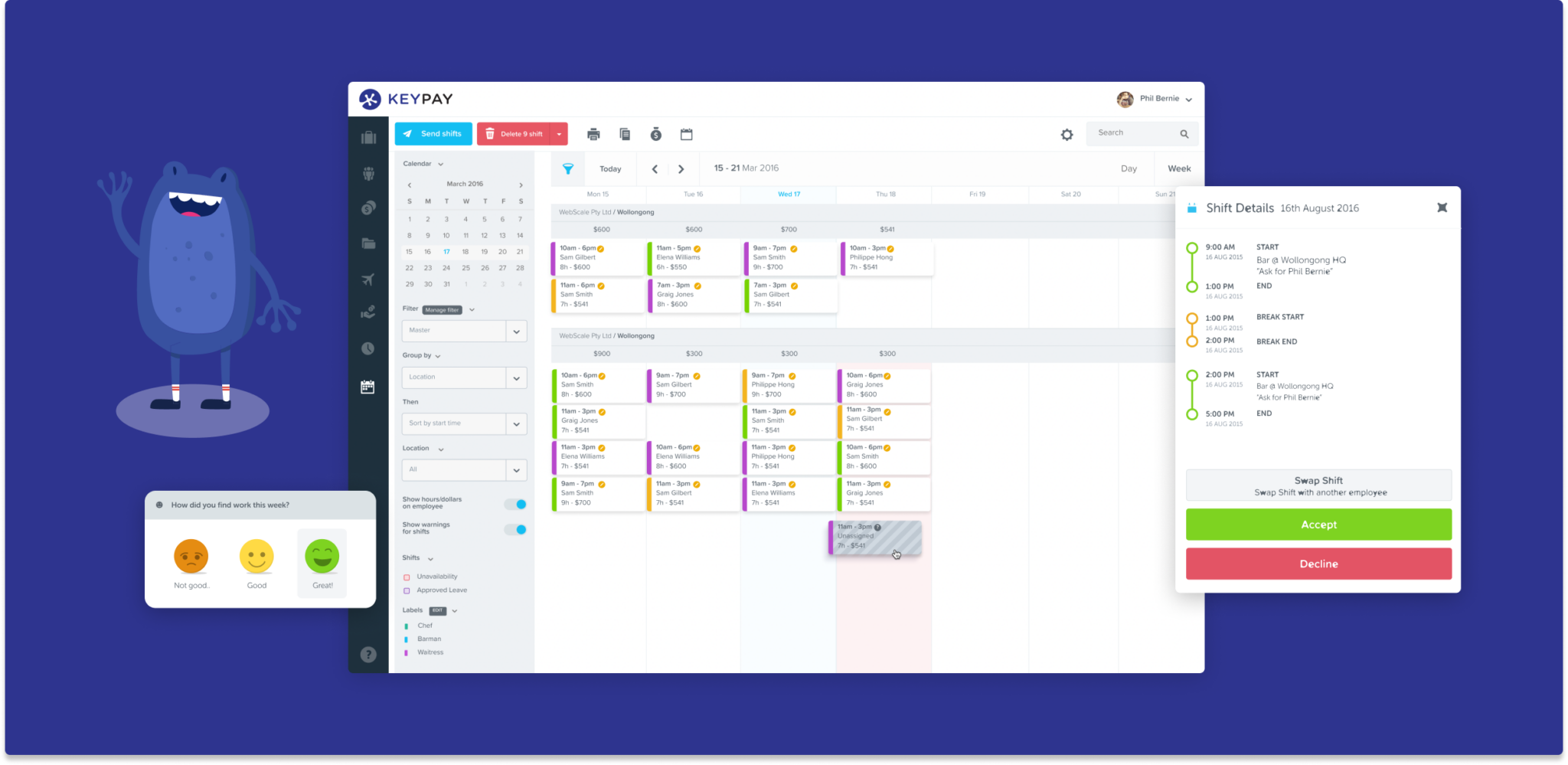
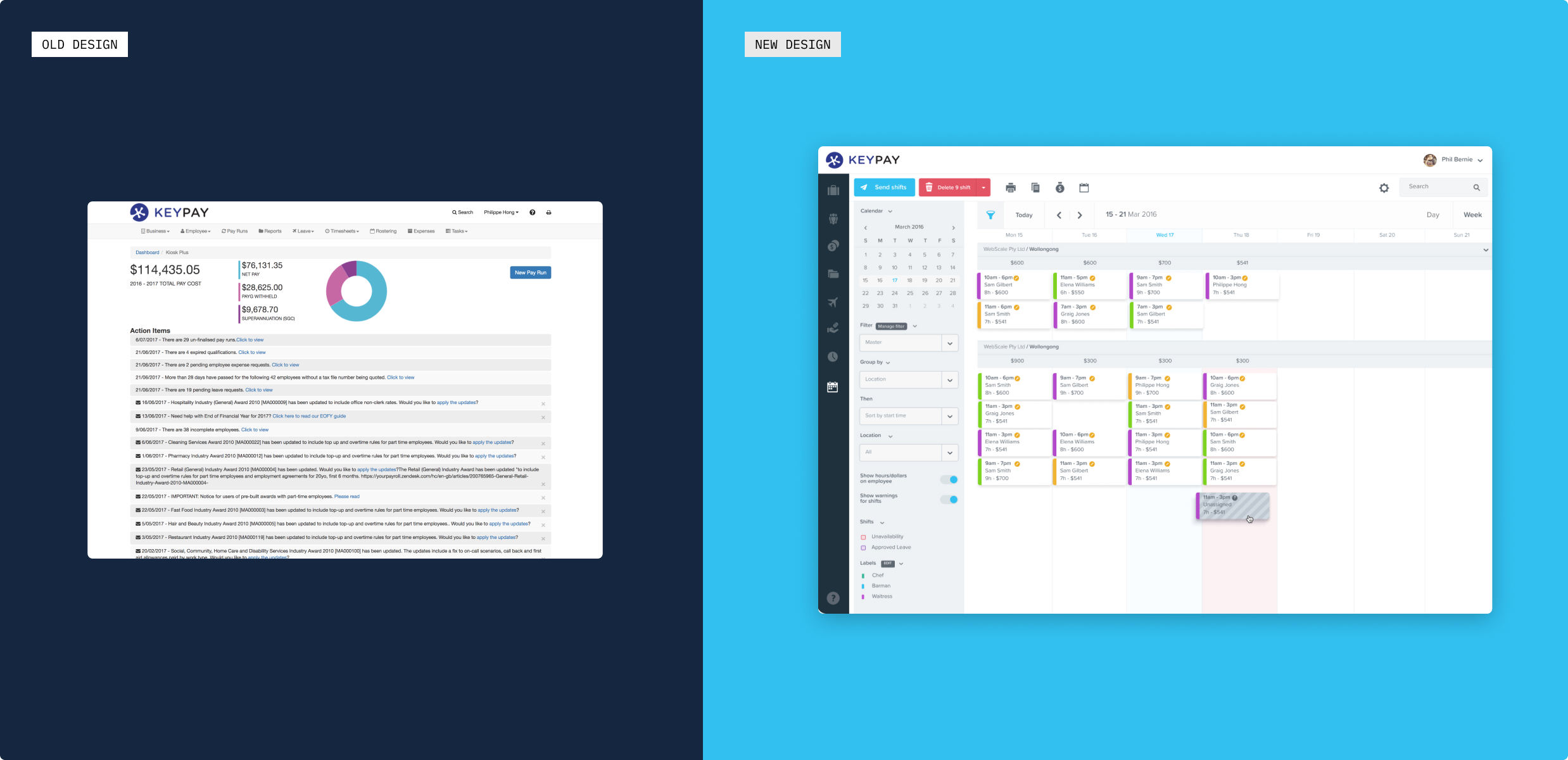
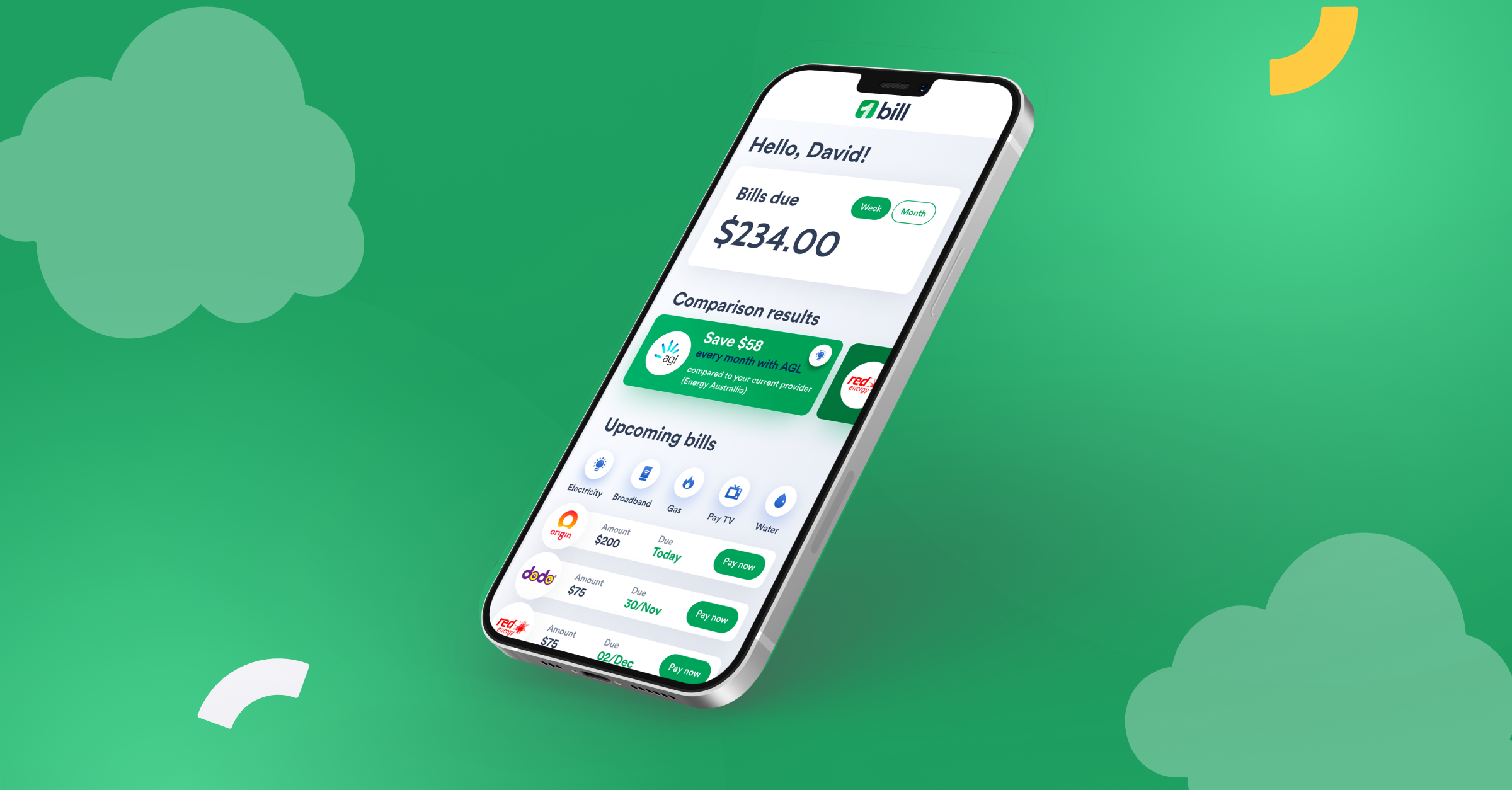
New user-focused interface
User interviews revealed that existing customers found the old software clunky and hard to use. It was missing the fun element KeyPay was all about. We’ve applied the insights discovered in the research phase and developed an exciting product that made users feel empowered.
Testimonial
I worked with Raw.Studio for a little over 2 years and in this time, was inspired by their design tenacity and curious nature. They have a unique ability to understand the personality of a brand and translate this into an impactful design that truly represents the nature of the organisation – a skill that is extremely rare and highly valued.


Next Case Studies

Creative product design that gets results
Take your company to the next level with world class user experience and interface design.