.svg)

Where a community becomes a catalyst for game-changing ideas
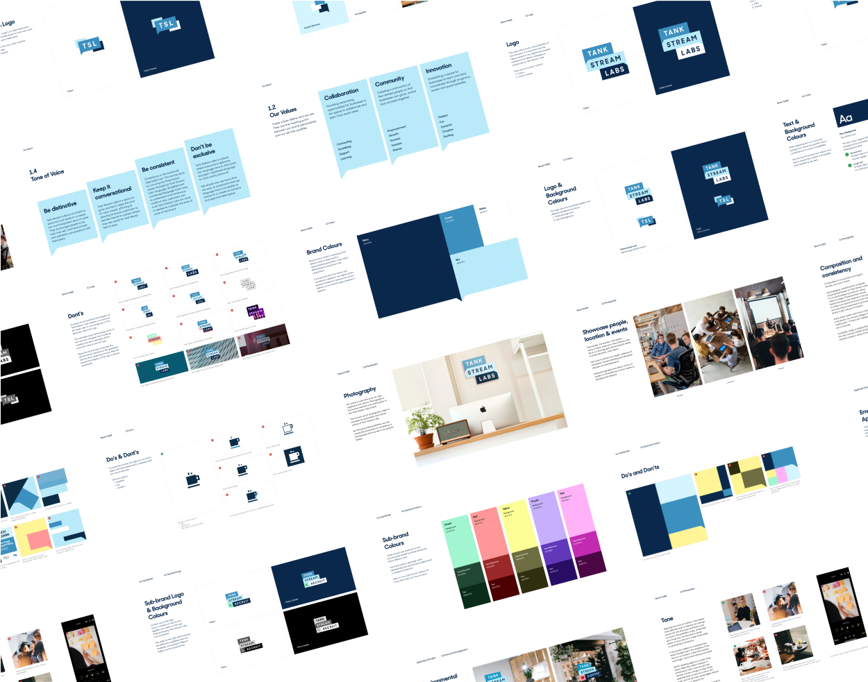
A new look for Tank Stream Lab.
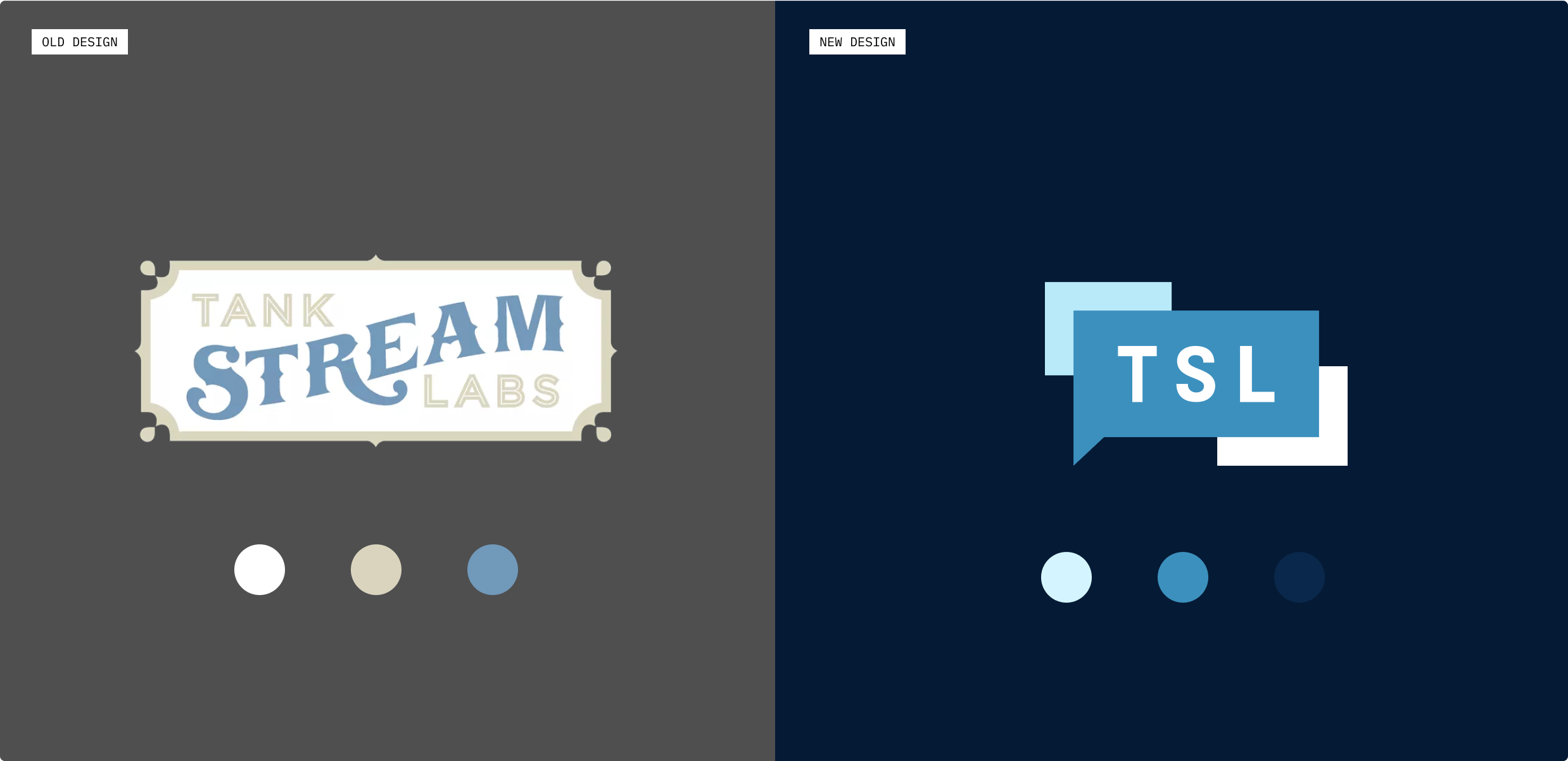
Tank Stream Lab wanted a brand refresh that would break their existing heritage look and feel. The logo has been a recognisable feature of the ‘Tank Stream Labs’ that is well known within the Australian startup industry since they started in 2012.
The previous logo represented its roots from where it started with its heritage look and feel. However, as the startup and technology industry has evolved, so has Tank Stream Labs and they felt their branding and logo needed to adapt.

A brand strategy and business values refresh.
This project aimed to create a brand strategy that would reflect their business values. It should also enable our client to consistently apply the new visual language across all their print and digital mediums.


Establishing the brand strategy
To understand TSL’s vision, values, positioning and personality, we went through brand strategy workshops, which led us to several valuable insights:
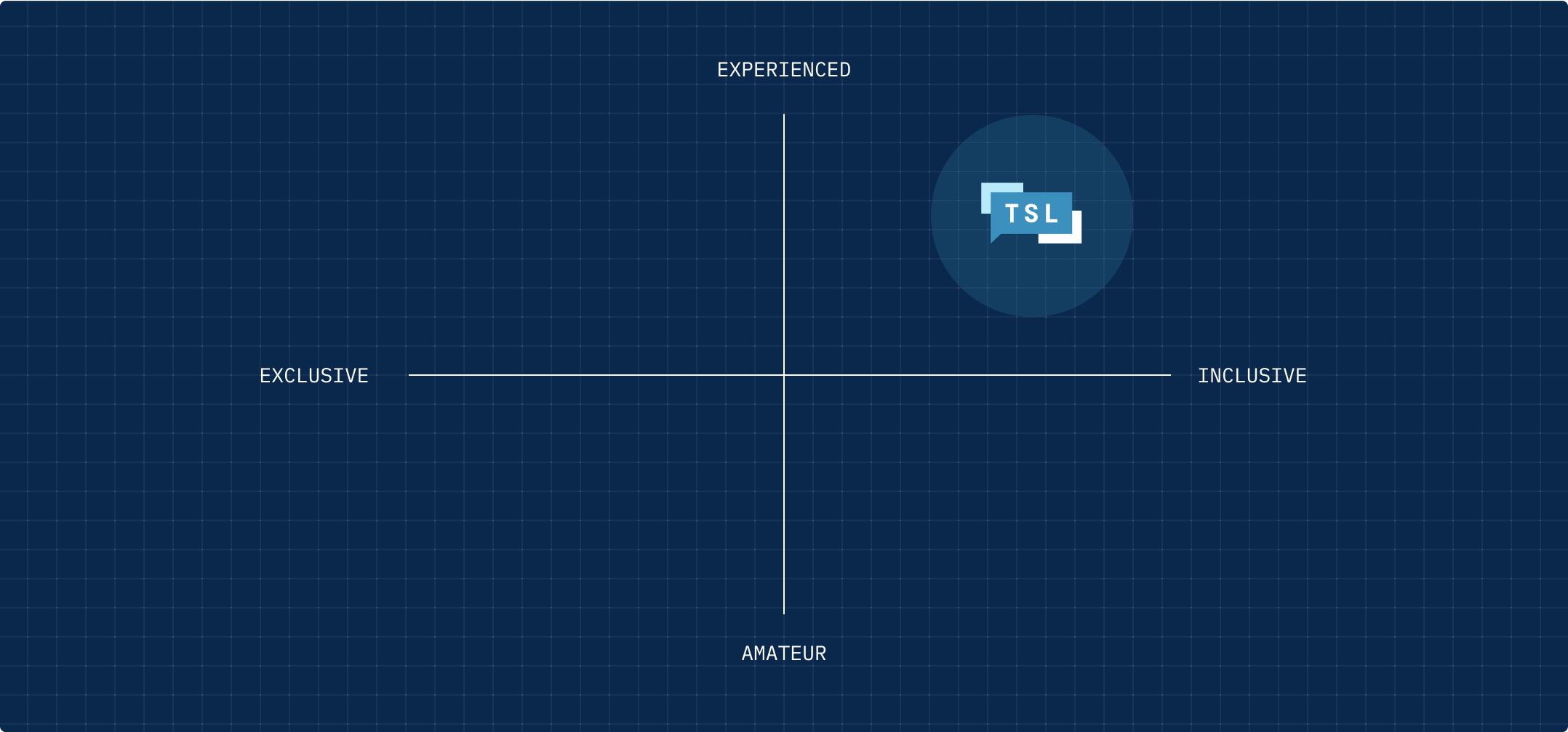
- TSL wanted to stand out by positioning themselves as experienced yet inclusive
- TSL wanted to portray themselves as fun, dynamic and innovative
- Reflecting the Idea of collaboration, as deeply rooted in TSL’s values
- TSL is the partner that helps businesses connect and grow
Conceptualising the brand
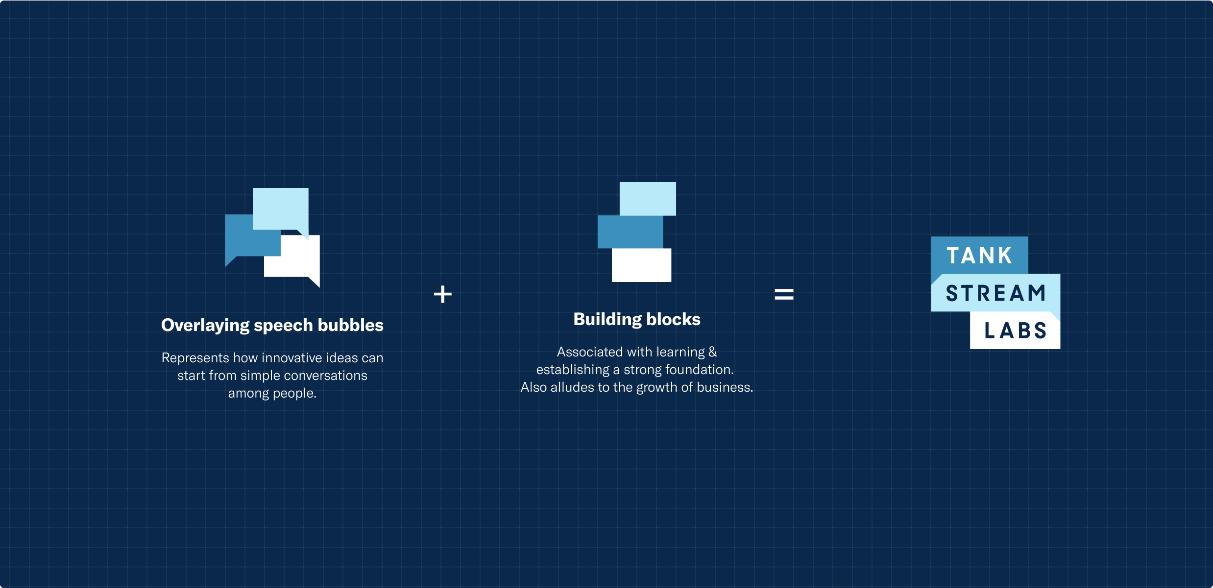
Using the values uncovered in the brand analysis, we took these as a guide to reflect in the new logotype.
The new logo mark adapts the speech bubbles – that stand for collaboration and community, along with the building blocks, which represent learning and growth.
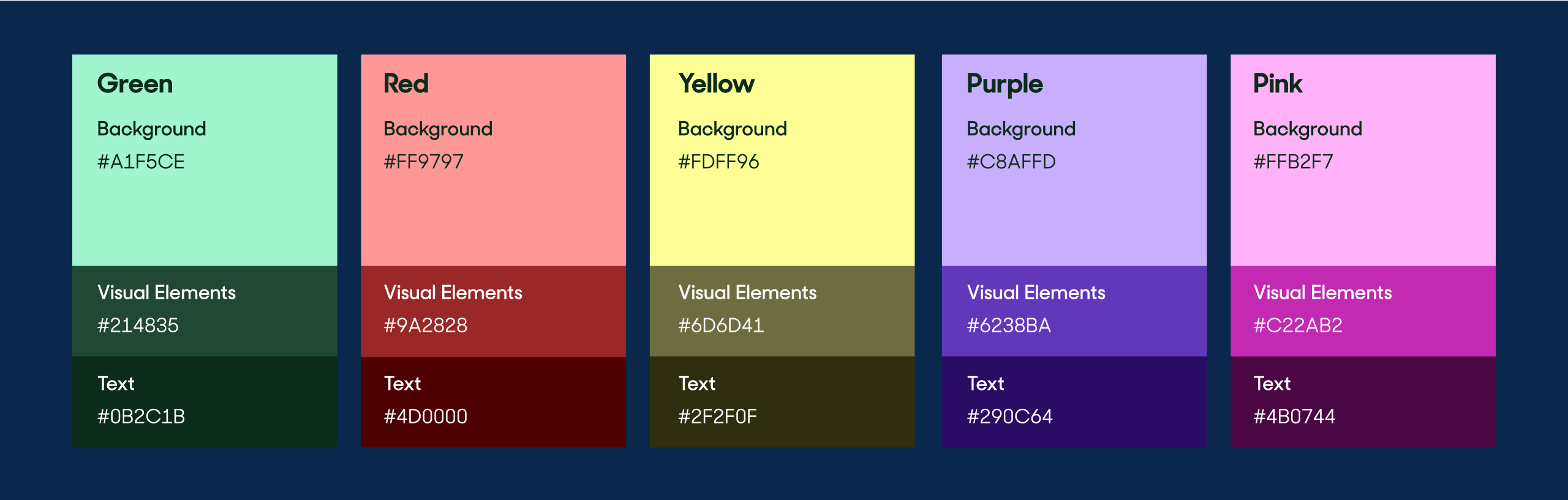
Modernised colour palette
To maintain the connection TSL’s customers already has with the brand, it was important to reference their existing colour palette.
Instead of proposing new colours, the old palette was refreshed to match their new brand personality of vibrant, fresh, and modern.
Designed for scalability
As part of the branding, TSL also wanted to create scalable sub-brands built around community. To reflect this, we created an ecosystem of sub-brands derived from the main logo.
Adding a pop of colour and icons brought in a touch of fun and excitement to the sub-brand logos.

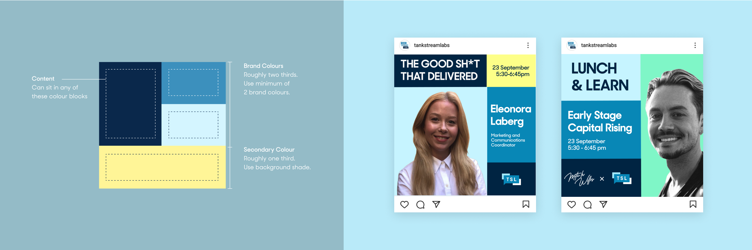
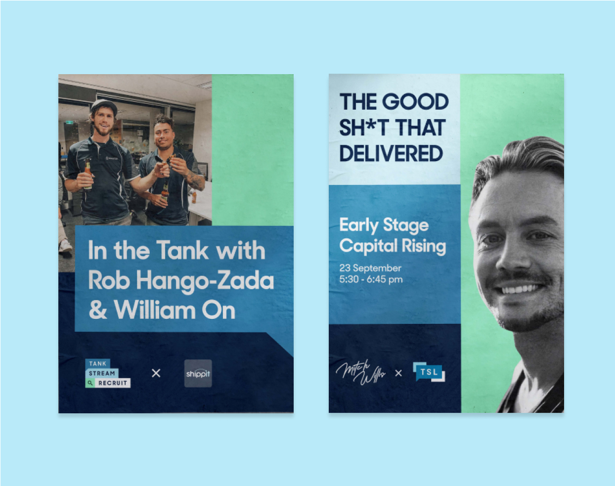
Visual language
As part of the brand refresh, we’ve also created a new systematic language to ensure consistency across collaterals. This enables them to effectively increase brand awareness and allowing them to be easily recognised.
Next Case Studies

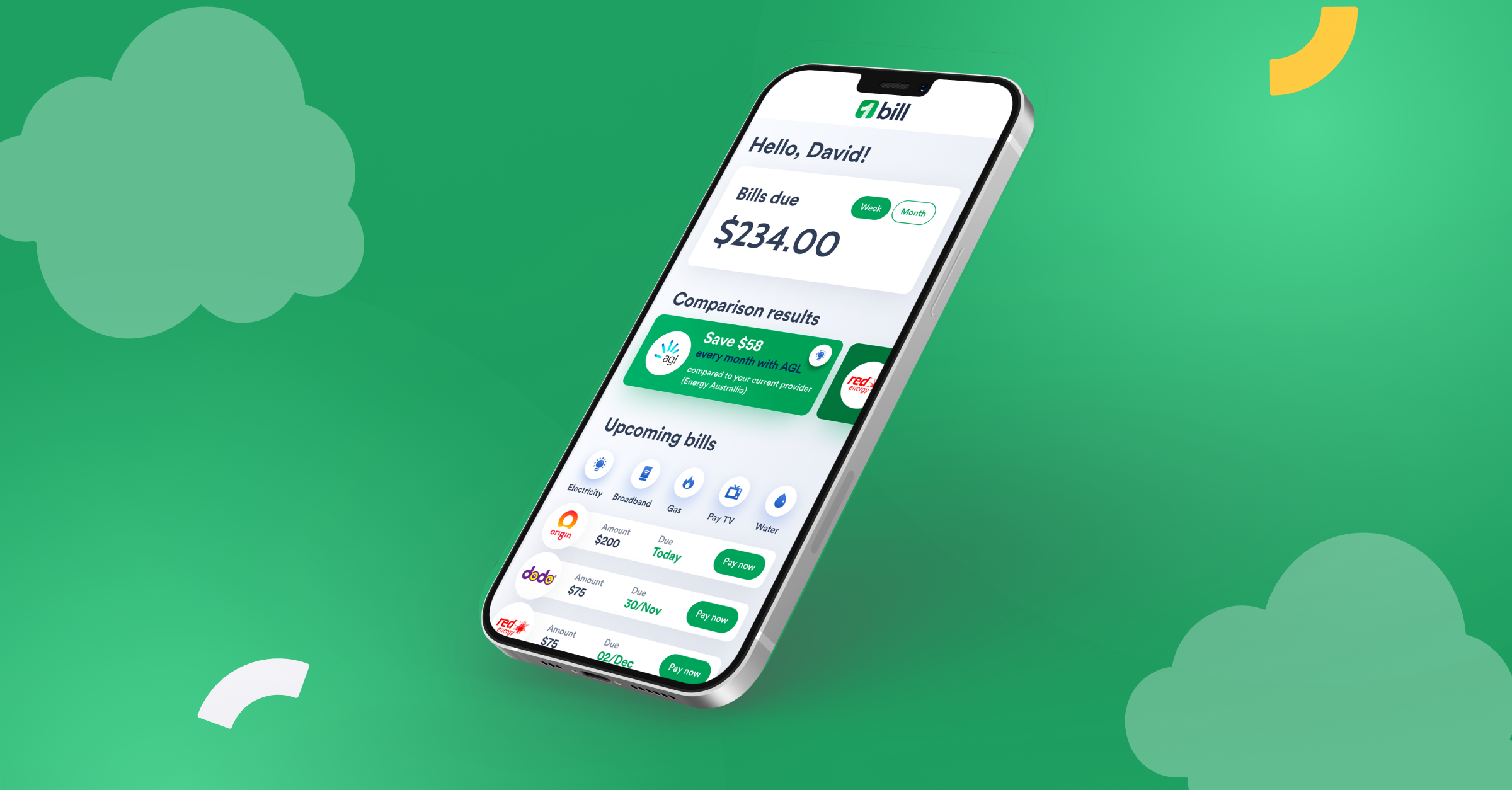
Bill's testimonial
Testimonial
We engaged Raw Studios to help our business with a complete rebrand process. The experience was very enjoyable with the team at Raw Studios very professional in their approach delivering exceptional ideas with creativity. We were very pleased with the outcome of the project. I would thoroughly recommend Raw Studios for any strategy or brand design project.
Creative product design that gets results
Take your company to the next level with world class user experience and interface design.